
Finger on the property pulse - Part One
Building a comprehensive property sales database and dashboard

This blog post documents the first stage of a data science project I have undertaken involving the application of New South Wales (NSW) residential property sales data.
In this first stage of the project, I have built a program using Python which automates the extraction, transformation, and storage of multiple years’ worth of New South Wales (NSW) property sales transactions.
The processed dataset is stored within an SQL database and is linked to a Power BI dashboard which visually portrays the best and worst performing real estate locations in the state. The program can automatically check whether new raw property sales data is available online to be processed – thus keeping the dataset and dashboard up to date.
Click here to watch me demonstrate how the Python program works, or keep scrolling down to read the full blog post, which details the step by step process I went through to build the dataset.
Click here to watch me demo the analytics dashboard. I consider this dashboard to be what I have coined, a ‘Minimum Viable Dashboard’ – one which will continue to be improved upon. By no means do I consider it, in its current state, to be fully polished or exhausted of all potential features.
The remainder of this blog post provides a brief description of the overall data science project before diving into the processes involved in Part One.
Contents
Project Outline
Project Objectives
The aim of this project is for myself to gain theoretical knowledge and practical experience in the following data science disciplines:
- Data modelling (emphasis on reliability, efficiency, and scalability)
- SQL (Structured Query Language) and relational database management
- ETL (Extract, Transform, Load) data techniques
- Interaction with APIs (Application Programming Interfaces)
- Dashboard design and data analysis using Power BI (emphasis on functionality, applicability, and flexibility)
- Data visualisation (emphasis on creativity and end user understanding)
Part One of the Project
Part One of the project involves building a custom dataset (via an ETL process), stored within a MySQL database and later represented by a data model within Power BI. In the process I will have further developed my Python programming and SQL querying skills.
The following four phases are included in Part One:
- Using Python to extract, transform, and store and raw dataset
- Using SQL to query, analyse and further transform the new dataset
- Using a geocoding API (Application Programming Interface) to further enhance the dataset
- Using Power BI to model the dataset and create a ‘Minimum Viable Dashboard’ (MVD)
Later stages of the project:
Continually build upon the dataset, adding further dimensions and variables, to produce richer insights via Power BI dashboards and reports.
Custom dataset requirements:
- A large dataset spanning thousands of records with a minimum of 10 to 15 labels (columns / independent variables).
- The dataset should ideally possess time series and geographic components.
- The dataset should have no monetary cost in acquiring it.
- The topic and potential insights to be drawn from the dataset should be of personal interest to me.
- The dataset should reflect a reasonably complex data model.
Raw data chosen for extraction and transformation:
After much deliberation and scouring of the internet, hunting for open data sources, repositories, and web scraping inspirations, I stumbled upon data pertaining to records of property sales in NSW.
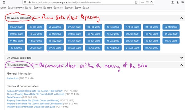
The raw data can be sourced from this website: https://valuation.property.nsw.gov.au/embed/propertySalesInformation
The data is uploaded in bulk onto the website using DAT files. There are separate DAT files for each of the 130 geographic districts that a property could be located in. And files are uploaded weekly, meaning that in order to process a full years’ worth of property sales data one would need to collate thousands of DAT files.
I deemed this raw dataset to be highly appropriate for my project as it met all my requirements. I also have a familiarity and interest in the different suburbs and regions of NSW and working with such a dataset would also allow me to gain knowledge of the real estate market of my own home state.
I also saw the potential to link the geographic data points (i.e. Suburb, Street, Postcode, District) to other secondary sources of geographic data (such as population, demographics, commercial activity, proximity to other locations, etc).
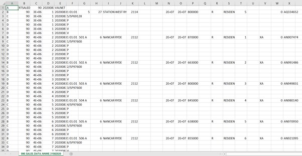
Pictured below is a screenshot of what one of the DAT files looks like if you open it up in Excel:
Building The Program
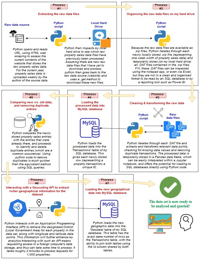
The program in its final form
As previously mentioned, I have built a program using Python which automates the extraction, transformation, and storage of property sales data.
Essentially, with the click of a button, my python script runs the entire data ETL process. If you already had the database set up, and wanted to download and process new raw property sales data so that the dashboard displayed fresh property insights, then the program can do this automatically.
The following diagram illustrates how the program works:
Click here to watch me demonstrate how the Python program works, or keep scrolling down to read the full blog post, which details the step by step process I went through to build the dataset.
Disclaimer about the step by step process I went through
The following documentation of the ETL (Extraction, Transformation, Loading) process I undertook does not cover every troubleshooting event and revision of code that I made. To reduce the length of this report, I have not explicitly included any Python code. However, throughout this report I have included links to several notebooks containing all the Python code needed to replicate the project. The online repository for these notebooks can be accessed with this link:
https://github.com/reggiealderson/NSWpropertysales
Before finalising the Python scripts featured in these notebooks, I had already gone through several test cycles of extracting, transforming, and loading data, while assessing the cleanliness and completeness of each separate test dataset. There has been much editing of Python code and SQL querying in order to get everything to run efficiently and to minimise the occurrence of missing data.
There are imperfections with the raw data (sourced from the NSW Property Website). However, leaving most of these imperfections unattended would not have been a sensible decision if I were to take seriously the validity of future insights drawn from the final custom dataset. In this report I will refer to a few of these imperfections which I have needed to tackle.
Obviously during this initial phase of the project, I did not need to process each property transaction record from multiple years’ worth of property sales data. This report follows the progress of an initial dataset with a sample size reflecting 12 weeks of property sales transactions. This equates to roughly 33,000 individual property sales transactions (in the raw, unprocessed dataset) and was a large enough sample size to allow me to spot any significant flaws in both my code, and the validity and consistency of the raw data. It is also a small enough sample size to prevent unnecessary delays in the processing of data at such a preliminary stage of the project.
Step 1:
Using Python to extract and transform the raw dataset
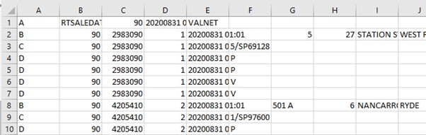
The first step I took in extracting data from the raw DAT files was to identify the data points that I deemed relevant and useful for future analytics reporting. Below is a zoomed in perspective of one of the DAT files viewed in Excel.
As you can see it is quite unclear what each cell refers to. In order to make sense of it all I assessed the technical documentation of the raw property sales data to understand the meaning of each column and row. See the below screenshot showing where the raw DAT files and technical documentation are sourced from. As previously mentioned, these files are sourced from this website: https://valuation.property.nsw.gov.au/embed/propertySalesInformation
I then created a Python script that inspects each DAT file, and extracts data from only the relevant columns and rows. While creating this script, I simultaneously added code that transformed the raw data into a cleaner format and structure.
The linked page below provides my Python script and commentary detailing the extraction and transformation of the raw property sales data. It also acts as a tutorial for anyone wishing to reproduce either an exact replica or similar dataset to the one I created.
https://github.com/reggiealderson/NSWpropertysales/blob/master/Phase1.ipynb
Writing the Python code featured in this link allowed me to establish an automated and efficient initial ETL procedure.
☑ In the less than 2 seconds, raw data was extracted and transformed from 1,400 DAT files (equating to 32,968 property transactions and 494,520 data points).
☑ Data points reflecting each property’s sale value, contract and settlement dates, geographical and address information, size, and type, were stored in a python list format, ready to be stored in a more suitable tangible format such as CSV file or relational database.
☑ The code was able to remove and ignore all irrelevant data points.
☑ The code could standardize the data point relating to the size of the property – converting hectares into squared metres wherever there were discrepancies.
☑ It is now much clearer whether a property is a house or is a unit, whereas the raw data did not have such a simplified Boolean data point to distinguish this.
☑ Extra code was added to check for missing data points, as well as to delete records with missing data points if need be.
I subsequently saved the processed dataset into a csv file, ready for upload to a MySQL database.
Step 2:
Using SQL to analyse and further transform the dataset
For the 12 weeks of property sales data I was working with, I saved the processed data into a csv file in anticipation to load it into an SQL database.
I chose MySQL as the relational database management system to handle my dataset and used the accompanying MySQL Workbench software to run SQL queries. It is possible to run SQL queries via Python code, but the Workbench is much easier to use and includes shortcut tools that speed up the process. I would however need to use Python code to load the dataset into a MySQL database.
For a more technical documentation of the procedures applied within this phase, please click the link below, which includes SQL and Python code that anyone can copy.
https://github.com/reggiealderson/NSWpropertysales/blob/master/Phase2.ipynb
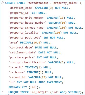
In summary, I created a MySQL database titled ‘testdatabase’ and inside this database I created a table which would exist to store my dataset inside. After consideration and tweaking of the assigned SQL data types that would correspond to each of the 15 data points (columns) per property sales transaction, the following SQL query was written, executed, and subsequently the table, titled ‘property_sales’, which would store the dataset, was created. An extra ‘id’ column was included so that each entry into the table would automatically be given a unique id.
Python code was then used to load the dataset into the ‘property_sales’ table of the SQL database.
Inside the MySQL Workbench application, I ran several SQL queries to ensure the correct number of rows were stored in the table, as well as to find and delete duplicate rows. Using SQL queries, I found and removed 4,314 duplicate entries. This figure equates to a 13% reduction to the size of the dataset. I was incredibly surprised the raw dataset included such a high proportion of duplicate entries.
In the subsequent, streamlined ETL process (in which the whole ETL process can be automated with the click of a single button), I use Python code to remove duplicate entries (as this method takes a matter of seconds to process as opposed to several minutes using MySQL).
Step 3:
Using a geocoding API to enhance the dataset
While querying the data in MySQL Workbench I noticed that the number of unique district codes featured in the dataset was greater than the number of districts listed in the technical documentation for the raw data (linked below).
I also noticed the following warning in the documentation:
“A property’s recent district code and district name may change over time due to council boundary alignment and council mergers. Accordingly, district references for sales data files may change from year to year.”
Essentially, this means that the district codes given for each property transaction are unreliable given they change over time. And I could not find any version control resources (relating to changes in district codes over time) available from NSW government websites.
I wanted to use a property’s geographical district as a filter/segment in my future analytics reporting and exploratory data analysis. So, I was not going to ignore this problem.
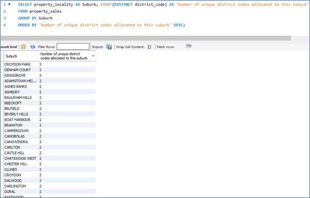
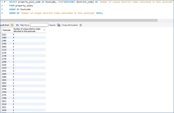
Unfortunately, I could not simply reassign all rows in the dataset to a revised district code based on the value in the suburb or postcode fields. This is because many suburbs and postcodes span multiple districts. As evidenced by the results produced from the following SQL queries:
It is also worth mentioning that on another test run I did for this project, where I used 8 weeks’ worth of property sales transactions data where the settlement dates for each property occurred in 2018, that the discrepancies in district codes and suburb / postcode data was even more pronounced.
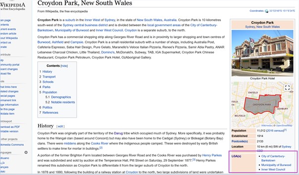
This non-uniform characteristic relating districts with suburbs and postcodes is further verified by a quick Wikipedia search for some of these suburbs. See an example screenshot below where I have highlighted in a pink box the indication of multiple districts per one suburb.
However, I came up with a solution. I found the NSW Government’s Address Location Web Service (linked below), which is an API (Application Programming Interface) that anyone can interact with via a web browser. Essentially it allows you to enter certain locational parameters pertaining to a property in NSW, and the API returns a JSON object (which is basically a simplified data container) that holds a bunch of information pertaining to the property – including its designated Local Government Area (district).
http://maps.six.nsw.gov.au/sws/AddressLocation.html
By creating a Python script that can interact with the API, I could automate the retrieval of the correct up-to-date district name for a property in the dataset.
The API required clean inputs for both a property’s street name and suburb. Included in my Python script is several lines dedicated to transforming the data points relating to house number, street name, and suburb name – in order to transmit accurate and acceptable data to the API.
Because there are numerous data entry mistakes relating to these data points in the raw data, I could not achieve 100% success rate in terms of generating responses from the API.
However, I managed to retrieve an accurate designation of district names for 99.56% of the dataset. I figured the loss of 0.44% would not affect reporting and statistical inference for most of the relevant analytic measures I would use in my Power Bi dashboards and reporting.
Furthermore, I also used the API to retrieve latitude and longitude coordinates for each property, as these data points might come in handy later when I experiment with my analysis in Power BI.
The linked page below provides my Python script and commentary detailing the process I went through in this phase of the project:
https://github.com/reggiealderson/NSWpropertysales/blob/master/Phase3.ipynb
To summarise, this phase of the project achieved the following:
☑ Automated the retrieval of geocoding data for 28,526 properties, representing 99.65% of the total number of properties in the dataset. This API retrieval processing took 45 minutes using Python code.
☑ Created a cleaned street name variable for each property transaction in the dataset. This new variable (which is a string containing the street name without any unnecessary characters or road type words/abbreviations) could be passed through the Address Location Web Service API with a higher success rate in terms of generating district and longitude/latitude coordinates.
☑ This new street name variable can also be used to better filter Power BI charts and tables – if one wanted to filter by street name in their reporting.
In my case I loaded the new geographical data into a new table in my SQL database. See the screenshot below where I run a few SQL queries to verify and analyse the new geocoding data.
Checking that the new table (titled ‘geocoding_data’), which stores the new geocoding data, contains the same number of rows as the pre-existing ‘property_sales’ table:
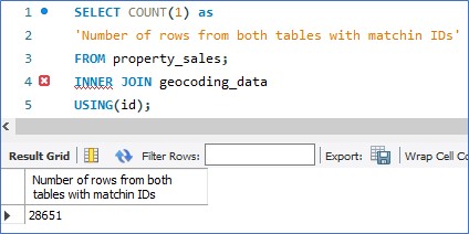
28,651 was indeed the figure I was looking for.
What if we wanted to see the number of distinct district names in our database versus the number of distinct suburb names and distinct postcodes?
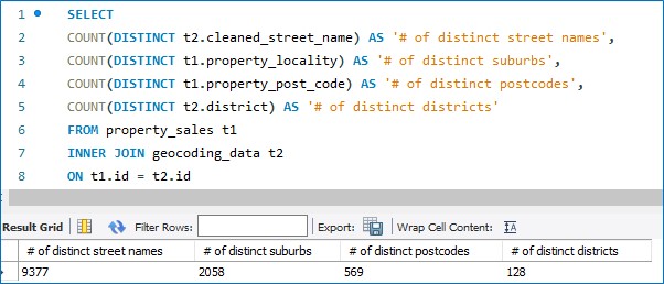
Interesting… So, there are 128 distinctive districts in the dataset, 569 distinct postcodes, 2,058 distinct suburbs, and 9,377 distinct street names. Of course, identical street names could feature across multiple suburbs.
I wonder what street name is the most common in terms of how many districts it is found in.
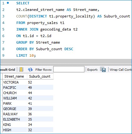
Looks like Queen Victoria spread her name as vastly as she could.
And what is the hottest street on the market when it comes to volume of property sales? My guess is Kerr Avenue in Miranda.
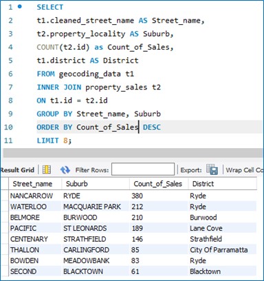
Looks like the Mayor of Ryde likes his/her zoning regulations nice and loose.
And which district has the highest average property sale value? Let’s run two separate queries. One for transactions pertaining to the sale of units, and one pertaining to the sale of house. We’ll also make sure our sample sizes are at least n=50 so as to improve validity.
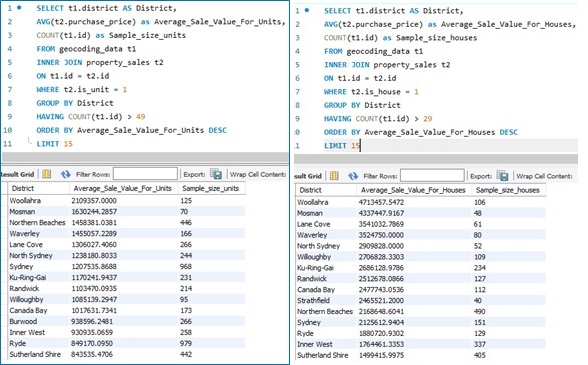
The Northern Beaches tends to rank higher for average unit sale price relative to house sale price. Maybe one pays more for the views one might get from living in a high-rise apartment building near one of the many beaches on the Northern beaches. We could go on further and look at the size of the apartments, the exact suburb (whether it is close to the coastline or further inland), etc. But my main mission was to confirm the new geocoding data is stored correctly and swiftly move onto Power BI!
Building The Dashboard
The remainder of this blog post discusses the use of Power BI to model the dataset and create a Minimum Viable Dashboard.
Inside Power Query Editor
I used the Power BI Power Query Editor to transform the dataset in preparation for efficient querying and analytics reporting via the dashboard.
The following steps were taken inside the editor:
- Launch Power Query Editor and load in the two tables from the MySQL database
- Select the Transactions table and click ‘Merge Queries as New’ in the Combine section of the Home tab.
- Within the new merged query, remove unnecessary columns, rename columns so they are understandable and are without underscores, and set up all necessary dimension columns are set up.
- One by one, duplicate the merged query for each dimension table and fact table and remove all irrelevant columns. For dimension tables, select the column with the fewest unique values, then select remove duplicates, and then create an index column within the dimension table that will later be linked to the main fact table/s.
- Create two separate date dimension tables (one for the Settlement Date dimension, the other for the Contract Date dimension).
About the Data Model
Here is the data model I ended up with within Power BI:
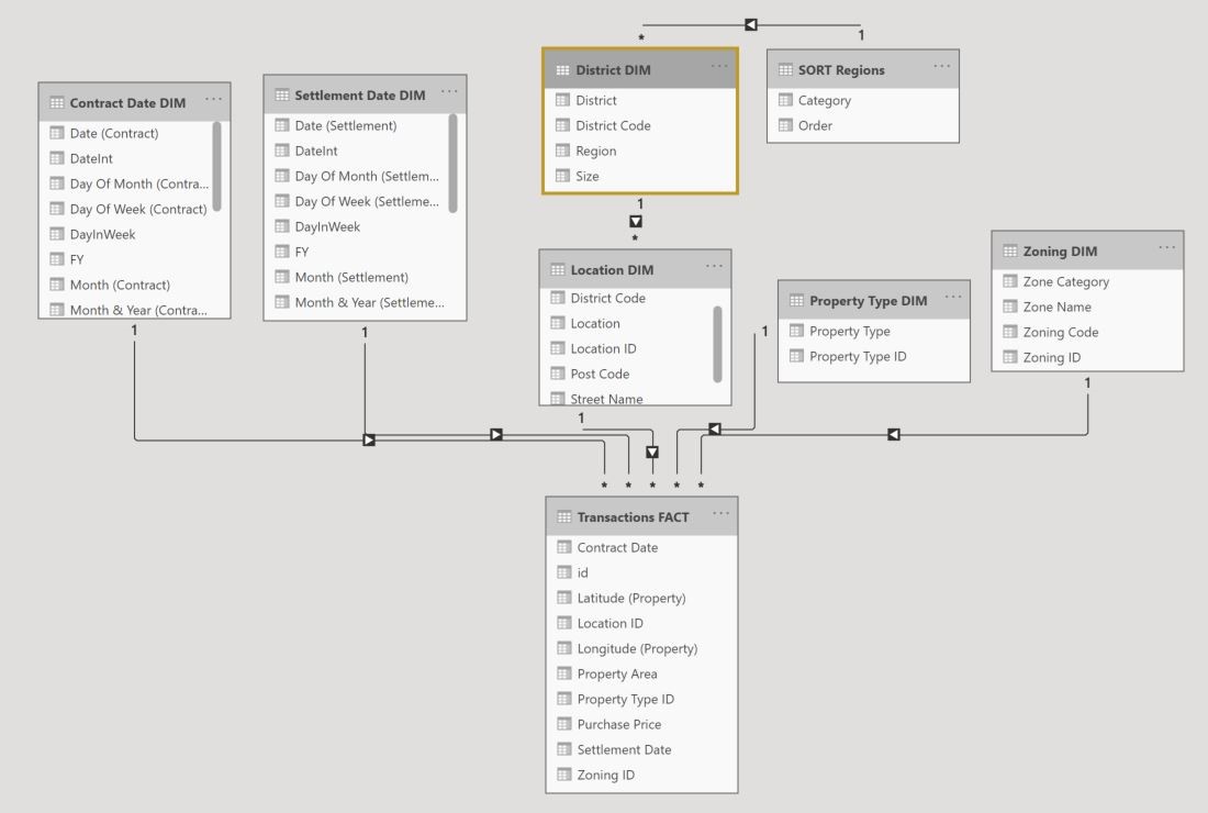
This model resembles a star schema, which is a model that classifies each table into one of two types – dimension tables and fact tables. Dimension tables contain columns (variables) that are used to filter and group data, while fact tables contain columns that represent transactions or observations, such as purchases, sales, requests, etc.
In the case of my data model, there is one fact table, and several dimension tables. The fact table is named ‘Transactions FACT’ and stores the numeric event data including purchase prices, dates, property size, and longitude and latitude coordinates. Also contained within this fact table are multiple ID columns known as surrogate keys and are used to provide a unique identifier for each dimension table row.
The dimension tables each surround the fact table, providing ways to filter and slice the numeric data in the fact table. For example, the Location DIM table stores categorical data pertaining to a property’s geographic traits. A one-to-many relationship links the Location DIM table to the Transaction FACT table in a way that for every property transaction there can only be “one” distinct selection in each of the Location DIM table’s column variables, while for each of the DIM table’s column variables there could be “many” potential properties. I.e. the Post Code ‘2250’ could be linked to many properties, but only one Post Code can be assigned to each property sale in the Transactions FACT table. Note that there also exists a table named ‘SORT Regions’ linked to the District DIM table. This is a special table that helps to sort the Region categories in a tailored manner.
If this were a data model used for transactional database, the star schema model type would potentially be unsuitable, because if changes needed to be made to certain categorical variables, such as the naming of a certain Suburb, or if a Post Code were to be added, then it would be better to have organised the tables in a way that reflects proper data normalization – which typically increases the number of dimension tables in the model, and splits columns within a denormalized dimension table into multiple normalized tables so that the transactional database is built to reduce redundancy and increase data consistency. But because Power BI is used for reporting, as opposed to performing CRUD (Create, Retrieve, Update, Delete) operations, we can denormalize the dimensions, and increase query efficiency.
It is worth noting that within my data model, the column storing the District categories is held within a separate dimension table to that which holds suburb, post code, and street categories. This was a subjective decision made by me to split these dimensions apart. I wanted to allow for easier interpretation of the model, as I will potentially add more columns related to Districts – such as District population, resident income levels, and other demographic data. I would rather keep this information separate from the Location DIM table, and because the District column possesses low cardinality (few distinct values), I feel as though not to worry about the potential query delays from added an extra normalized dimension table to the model.
The Minimum Viable Dashboard
I have produced what I have coined as a ‘Minimum Viable Dashboard’ – one which will continue to be developed upon and be further enhanced. By no means do I consider it, in its current state, to be fully polished or full of all potential features. I wanted it to be good enough so that someone working within the real estate industry / any residential property related field could use it and gain practical insights that they otherwise would have had to pay for.
Pictures below is a screenshot of the dashboard’s user facing interface:
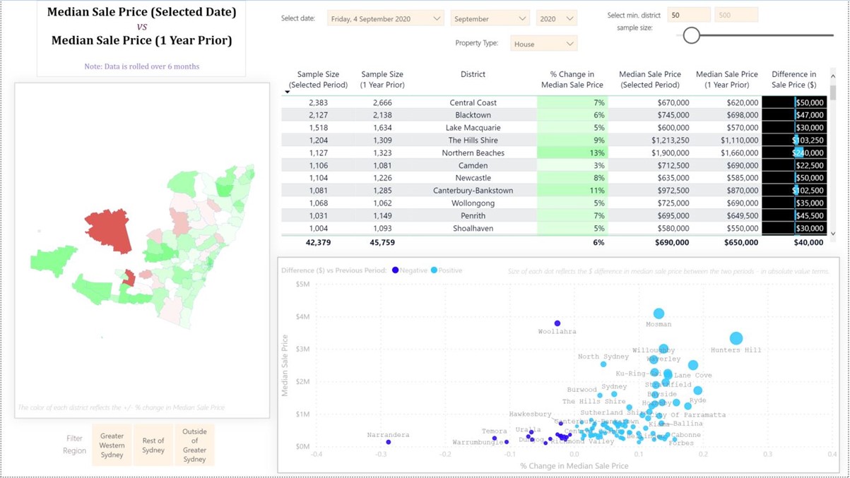
From a User Interface standpoint there are two broad elements built into the dashboard. Those being filters and the other being visualisations. There are three main filters positioned at the top of the interface, one for filtering the data in the visualisations by date, one for filtering by property type, and one for filtering by sample size. A fourth, and less important filter, is displayed in the bottom left of the interface, which is used to filter the data by three large geographic regions – useful, for instance, in comparing districts with each other that are all located within the Greater Western Sydney region.
There are three data visualisations. The one on the left is a Shape Map, which visually contrasts the differing districts in New South Wales. With this visual the user can make several interactions including zooming in and out, selecting a district to focus the other two visualisations, and hovering over each district to provide various statistics pertaining to that district. The second visualisation is a table, located in the top right-hand side of the interface. This gives precise figures for each of the key metrics pertaining to the overall theme. I should mention that the overall theme is a comparison in property prices between two periods – as denoted by the title located in the top left-hand side of the panel. The third visualisation is a scatterplot and is used to visually compare four different metrics all within the same two-dimensional space. The Y and X axis of the scatterplot convey Median Sales Price (Current Period) and the % Change in Median Sale Price. The two differing shades of blue for each dot separate each district as either one which has had an increase in sale price or a decrease. The size reflects the absolute value in the change in median sale price.
I have ensured all elements, including colour schemes, are labelled, so as to give an immediate explanation to the user. The sample size filter is an important element in my opinion – and one which I feel is underutilised in dashboard design (from what I gather during my research). The importance comes from the potential to be misled by distinctions in colours and sizes of bars when comparing each district. A district with less than 10 transactions for a selected date period can produce wild swings in median sale price – thus standing out in the visualisations, which is not ideal if validity of insights is of importance to the end user.
Watch me demo the dashboard:
This ends Part One of my series of Finger on the Property Pulse posts. I aim to produce more insights and dashboard designs to share! Please let me know if you like what you have seen or have any requests.